Friday, May 12, 2006
REVIEW: Tine Benz
 Blank Walls are Criminal
Installation by Tine Benz
Galerie Jette Rudolph
25.3 - 6.5.2006
Well the shows over now so you can't really go see this, but it was a show worth mentioning. I personally have a soft spot for stuff about Chicago (i lived there for over 10 years). The paintings, among other cityscapes, includes a nice one of underneath the Chicago "El" (I'm going to guess, but I would say that it's the view looking south on Wabash Ave.) The collage(s) of replicating city images sprawling across the walls, wrap around the entrance and spill out onto the floor are perhaps a bit to slick and could easily fall into good design, which usually means shallow art or design that signs as art (but isn't). As flimsy as this stuff is there is a niche that Benz creates and would have more room to work in if she would just let go and start collaging on various levels. If your going to do the art school thing of having the road coming out of the wall, why not go all the way and combine painting, collage, video projection, scultpure, and whatever else you can get your hands on. Don't hold back.


28. -30 APRIL 2006 (SAVE THE DATE WEEKEND)
 This is a late post since the night of openings, but hey, time is somewhat relative in an age where we have virtual spaces to post within them.
 I only had enough time to go to walk around on the friday opening night, but was glad to see throngs of people at every location on the map given for the 28. -30 APRIL 2006 weekend. Opening nights like this are a bit of a spectacle and giving away free beers and selling bratwursts outside the gallery bring out the carnival aspect (What? No pony rides!) I hope someone had a bratwurst and filled up on beer before going into John Bock's installation at Klosterfelde. A staged suburban living room is turned into a carnival house of carnage, complete with blood soaked carpet, splatters of blood dripping down the walls, and body parts strewn about. With this folding of two worlds, the displaced suburbanite dwelling and the type violent display reminiscent of images of the floors of Abu Ghraib jail cells, it parallels the disconnect we

 have to the actual horror that is shown in those images. But, maybe the wrong-ness about this wannabe Paul McCarthyist work is that it plays it too safe, but unlike McCarthy, it's not taking the television medium *or in Bock's case the medium of performance art). Making it into a spectacle or a live, performed house of horrors that entertains without breaking the security of the picture plain. Costume vampire teeth are not sharp and like this piece, they don't bite very deep.
Next door to that photos of dwellings of homeless people and large paintings of transcripted text from video testimonials by the homeless people are hung (if a work sells maybe you should buy the guy, whose cardboard box you took a photo of, a sandwich or something, huh artist-guy!?). This show at least covers all the bases hedging its bets between video pieces ($), large scale photographs ($$), and large, though poorly stretched, paintings ($$$).

Hip and trendy Mitte plastered posters around for rock star artist Elizabeth Peyton's show, where the second largest crowd of the night and enough empty beer bottles to make it look like there was a rock show going on. Which I guess is the point of her popularity, because the paintings offered little more than what I had already expected to see.
There were a few hardcore works that I give my "Huts ab!" to. Unfortunately, it was late by the time I got to the the machine guns carved out of gravestones-- but I will perhaps review this work in a later post because it deserves it. But for the moment the blogger is giving me a hard time about loading more images, so instead of yelling profanities at it I am going to go for a walk and enjoy this lovely spring day.

Wednesday, May 10, 2006
REVIEW: Shintaro Miyake

Ni-Maru-Maru-Roku, in Doitsu
Shintaro Miyake
c/o Atle Gerhardsen
28.04 - 03.06.2006
(Photos taken with permission of the gallery)
This play soccer installation has New Japanese Pop Art's familiar

feeling of tetering on play and imminent catastrophe. The anime derived faces in the paintings, drawings, animation and costuming used in the performance/video are hysterical exaggerations of big headed soccer players all of which are in hysterics themselves!
There is a look of panic-stricken desperation in their eyes, like the players have to keep competing in World Cup entertainment for their country's pride while those watching the game in the stands or at home pinning their hopes on their country's team while trying to tune out a world that is increasingly a dangerous place, full of conflict and unrest.
The paranoia many people I suspect feel in "the back of our minds" after 9/11 is summed up perfectly with a little toy 747-Jet airplane flying over the installation.
"Oh no! where is the toy plane heading? Ist it freefalling? Is it going to crash into the stadium! Will there be another catastrophe? Will something like that happen at the REAL World Cup?"
The crying faces of the soccer players are faces of a public that are looking for a way to return to a time before suicide bombing attacks and the fear of their possiblity. I'm young to
 know, but I'm willing to bet that this was how people were feeling during the cold war. When the threat of imminent nuclear war looms in the air no one on either team feels safe.
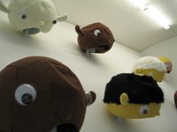
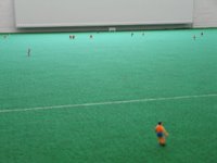
Again this installation does the balancing act of paring our imminent doom with our imminent fun, the video is a truly silly game of soccer played between people in giant wearable puppet masks which are also hung on the gallery walls like Muppet hunting trophies. The video's humor lies in how seriously the giant-headed players are playing the game despite their ridiculous
appearance.
Miyake times this exhibition with the beginning of the World Cup Championship beginning in June. To his credit he balances playfullness and empathy with the fears and hopes many of us have about what could be a hot summer both on
 and off the pitch.

REVIEW: Mona Hatoum
Works by Mona Hatoum
Galerie Max Hetzler
28.4 - 3.6.2006
(photo taken with permission of gallery)
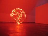
Hatoum hits her mark on several levels with Hot Spot, her first solo show in Berlin. One work is a large red neon globe of earth. The intense light radiates like the red hot grill of an electric stove and the sound buzzing from the lights is like a bug zapper. All of these sensations add to the feeling that our planet has of late become a very hostile and volatile place. The Red Alert neon borders pulse with the same electricity that also power electric fences and electric shock torture devices used by U.S. Soldiers on prisoners in the Guantanamo Bay detainment camp, and the same electricity that triggers devices the belts of suicide bombers, or pulses through T.V. screens that bring us images of our war bent government leaders promising hope and freedom[TM], but delivering instablity, paranoia, and the constant fear of surprise attacks from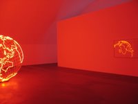 terrorists that, like in George Orwell's 1984, could be hiding around any corner.
The light of this piece fills the room and is reflected off the glass of the only other piece in the show. The second piece is paper that has been delicately torn with a razorblade to form a map of the Earth. With all the land being "torn-out" and essentially becoming uninhabitable holes for us to live in. If the governent leaders of the world don't see the folly of a future that presses the world to perpetual war than at least Hatoum does.
Another added sensation of showing the work here in the S-Bahnbogen, is the occasion ominous rumbling of trains overhead, which adds to an uneasy feeling of a world being pushed to the brink like a runaway train, which almost makes me think that the choice of location was intentional or at least an advantageous coincidence.
*credit to Wikipedia for filling in the blanks for this post.
REVIEW: Iñigo Manglano-Ovalle
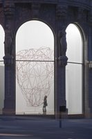
Red Berg (r11i01)
Installation by Iñigo Manglano-Ovalle
Galerie Thomas Schulte
28.4 -12.5.2006
(photo credited to gallery's website)
Red Berg (r11i01), based on the original Iceberg (r11i01) sculpture at The Art Institute of Chicago (I actually couldn't find a better link on the web than this one, What's with the archive at the Art Institute? Come on you guys!) is Manglano-Ovalle's second "generation" of the work via sonar information and 3d imaging of an actual iceberg off the coast of Newfoundland. This time around the artist combines his scientifically curious art practice with more clues to how he arrives at the final work by inserting a weather balloon literally into the monumental iceberg "wireframe" sculpture, with mixed results.
At first I was awestruck by seeing this sculpture again (the original in Chicago is even bigger than Red Berg (r11i01), and it truly is a monumental work), but then I began to think why did he do it again? The first one in Chicago is different in a few ways, it has black rods forming it's structure instead of red ones, it's significantly larger, and there isn't a weather balloon inside, but other than that it is essentially the same work. Is it a continuation of the first piece or a rehashing of it? Is it an update of the iceberg's condition since the last time he gathered sonar data of it? or is the weather balloon significant because it collected the data for the new 'berg'?
I'm willing to give Manglano-Ovalle the benefit of the doubt and wait untill I can find out more information myself about this piece, but I've seen other really great pieces he's done, so it's not a question of him not having enough fresh ideas. I'm just hoping this isn't the beginning of iceberg 'editions'. It would be a shame, because he's better than that, but if this is trying to work out some other ideas then just start a new piece and go from there. The original Iceberg (r11i01) in Chicago is going to be a classic, leave it at that and move on to the next-- stop fussing with it!
Tuesday, May 09, 2006
REVIEW: Jean Luc Moulène
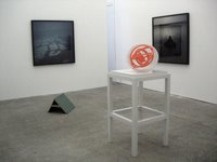
Works by Jean Luc Moulène
carlier / gebauer
4.29 - 6.03.2006
(photos courtesy of gallery.)
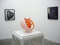
This installation places photos of objects like a computer monitor, a tv, and a common tupperware sculpture into a context of cosmic reflection. Paired with B&W photos of curious everyday natural phenomena
it creates a meloncholic feeling of the artist's distance from nature. There's
a longing to understand why these curious Universal structures reconsituted by industrial product designers become so commonly known, yet their purpose and 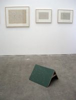 mechanism are seldom understood. The black and white photos and wonderful felt pen drawings point towards Moulène's wonderment with the heavens, but the products (both photographed and shown) perhaps best demonstrate how our consumer gadget-crazy society has pulled the wool over our eyes. Mondex, 2006 (the tupperware piece) is the most direct at navigating this "copy as orginal" artist's gaze through the mucky-muck to the mysterious universe he knows nothing about (but longs to) on the other side, but still requires the audience to make the jump past "it's just a tupperware bowl" to get to this interesting place. A place where Moulène has left several well positioned clues in his installation without
leading us like a herd of sheep, a well received message.
If the the artist is looking for more to explore in this work, maybe creating bridges between the consumer mythos and the "nature" mythos, the intersection being that these petrochemical plastic objects were composed out of and will one day return to the elements at the base. Our ideas about what they represent and how they can be used to either explore or distract from searching for answers are all that will remain. From a cursory glance at the gallery's website it looks as if he has plenty of work to fill in the edges, the balance between giving the audience enough direction that they can navigate the territory without playing a tour guide has always been delicate, this artist shows an awareness of this balance.